Tuesday, December 9, 2008

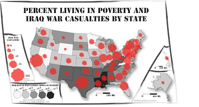
final.map


So, this is it. The end of a semester, the end of statistically-induced headaches (well, one can only hope), and quite possibly the end of this blog. Some things about my final map are still bothering me, but with the simplicity that I'd like to maintain on this map, if I keep messing with it I'm doing more harm than good at this point. So this is it - my final map.

And here are some links to accompany it! The salt and pepper, the seasoning to this bare-bones, meat and potatoes type map.

eIraq @ Twitter: A twitter that tells you about things going down in Iraq. Why a twitter page? Well, I just got myself a twitter tonight (click here if you're interested in following me), so I'm in a twitter state of mind. How ridiculous does that sound?

Basic info and history on Iraq: self-explanatory.

Capone N Noreaga - Iraq (See the World) @ YouTube: a song off of one of my favorite albums, that just so happens to be called Iraq. That's relevant...right? RIGHT?! Warning: vulgar language ensues. Why would two rappers call a song Iraq? Well, random trivia, Noreaga is from the Lefrak City housing development, in Corona, Queens, NYC, which is also known as "Iraq". See? This is educational. I could even map it for you.

Recent AP news story on Iraq War: interesting, and via Google news.

War Journal: My Five Years in Iraq: need some reading material to pass the time during winter break? Check out this book for sale through Barnes & Noble.

Wednesday, December 3, 2008

just.in.case


posting this so that in case the .ai file that I e-mailed myself to show proof of my, er...proof, fails, then I have a backup that is sure to work.

Haven't done much yet, I know, but I much prefer stressing myself out closer to deadlines. Pressure is such an adrenaline rush, don't you agree?

Sunday, November 16, 2008

lab.10.bivariate


Dang. Look at that. I made that! Yeah, I'm sure it's not perfect but it's the first lab I've done where Illustrator hasn't given me a ridiculous amount of issues. And dangit, it looks pretty fresh. I messed around with transparency a bit in this lab and said to hell with gradients, because frankly I'm sick of them. Transparency is sooo much cooler.

This was VERY time consuming though, I will say that much. It has officially taken up my weekend. Between sorting through data (and I had to convert my population stats to percentages as they weren't given in that format) and then mapping sooooo many counties (I vote for a state with less counties next time!!!, or at least VA where I'm semi-familiar with where they are), this really took a long time.

Map of the week:
This is a cool map because it uses choropleth to map one dataset, and a 3-dimensional aspect to map another. Makes for a visually interesting map, yet it's still pretty easy to read. It's clean, sharp, to the point, and yet creative at the same time.

Saturday, November 8, 2008

lab.9.color


Ah, the first dose of color. And that's all that this map got. After working on it for a while, I remembered why everything was where it was - because I couldn't get it to move anywhere else. Had I been successful, I would have moved Alaska and Hawaii around a bit and just handled that a little more efficiently. Illustrator really gives me problems. And I'm computer literate, I swear. It can't just be me.

...for the record, I enjoy how this map looked in greyscale more than I do in color.

Anyway, my printed copy turned out looking a lot like what the digital version did...colors were pretty much the same except the printed copy looked a little brighter and I felt like I preferred it to the copy you see on your screen. The text was blurrier on my printed copy than it was on the digital copy, though. Oh well, you win some, you lose some.


Map of the week:

(click to see the whole image)
This map is so cool looking - I just wish it had a title. It has to do with interstate transportation of wine, but that's about all I could figure out. I LOVE the colors, embellishments, lines...it's just gorgeous. But please...please give me a title so I can figure out what it all means!

lab.8.proportional.symbol


Hm. What to say? Not much really. My houses look more like factories because I left out that stereotypical triangular roof that is ever-so-popular in the simplistic style of house drawing. I was just having trouble getting it to work. I do think that the symbols stand out from the basemap well, though. That's a plus. Not bad, not great. Just glad it's done.

Map of the week (even though I'm not sure we needed one?)

This maps two variables - whether or not a country is landlocked, and it's population (as exemplified by the graudated symbols).

Really not much to say this week...didn't enjoy this map as much as the dot map, but found it easier than the choropleth.

Saturday, November 1, 2008

bay.area.benefit.show


Something unrelated to class, but that means a lot to me. In case you didn't know, I essentially live and breathe hip hop, and I absolutely love when hip hop meets positivity and politics.

If you know anybody in the San Francisco Bay Area, please forward this their way. It will be a great show (yes, I'm confident enough in this to guarantee it), and the money will go towards building an orphanage/school/clinic in Afghanistan that will serve Afghan children orphaned by the war. Thanks. If you have any questions about the event, feel free to ask me in class.

More maps to come, and I hope everybody had a safe Halloween!

Wednesday, October 29, 2008

lab.7.choropleth


I miss the dots. This lab gave me lots of problems. Now I'm tired, mentally drained, and SO over this. There goes my dot "high" of sorts.

I still have trouble with adding gradient. And you know what? I like it without it anyway. So take THAT, cranky Illustrator!

Brief statement about above maps: I feel like neither the natural breaks or equal interval produced strikingly different results. The only data intervals that had easily visible differences were the lowest two classes of percentages, which had the most data within them anyway. The outliers, like Nevada and Arizona, remained distinctively recognizable in both maps.

Conclusion from maps: a lot of new houses are being built in Arizona and Nevada. I HAVE heard that the housing market in Vegas has been growing for a while now, and it's really becoming more and more residential...so this goes along with what I've heard.

map of the week:

It's definitely a colorful choropleth map...but I wouldn't call it very effective. It's hard to tell what data represents the highest and lowest amount...it's pretty at first, but hard to comprehend. It's also almost too happy looking for such a depressing subject - HIV and AIDS doesn't make me think pink and yellow, nahmean?

Now if you'll excuse me, I need to get away from maps. ASAP.